Dear Cleo 17 11 21

Dearest  Cleo

Great day on Saturday, Nana Bet was pleased to see you, and I love the pizza at La Porqueta.These are the drawings I did at Life Class this week

Figure 1 (17 11 21 01) graphite on A2 grey sugar paper

Figure 2 (17 11 21 02) graphite on A2 grey sugar paper

Figure 3 (17 11 21 04) charcoal and pastel on A2 grey sugar paper

I must rush because I’m late for work put I posted you a real letter yesterday, you should get it tomorrow.

Love as always

Mickos xx


Dear Cleo 17 06 14

Dearest Cleo

It must be nearly half term for you, I hope you are looking forward to the holidays. I have my swimming kit in the boot of the car, so bring yours with you on Saturday and we will catch a swim.

I found some more scratching the first is an old chopping board I like the idea that the scratching took place over a long time.

Figure 1(17 05 31 01) Knifed, scratch marks on a polyurethane chopping board 250 x 200mm

The second two are not really scratching but they are caused by removing the air from an inflatable bed so the act of removal is present but it is the internal removal rather than an external removal. The only way I can think of replicating this process would be to paint on a Mylar balloon or a zip lock bag let the paint dry and then deflate.

Figure 2(17 05 31 02) Flatbed 1, folds in a deflated airbed 2200 x 1500mm

Figure 3 (17 05 31 03) Flatbed 2, folds in a deflated airbed 2200 x 1500mm

I hung the painting I did yesterday on the wall and I have decided it would look better if I went back into it with charcoal so I did and now it looks like this.

Figure 4 (17 05 31 04) What is he doing with the bread? Last Supper in an Italian Restaurant, Acrylic and charcoal on A3 Mixed media paper

The last step was really pleasurable to do, it was like drawing on a cave wall, art pure and simple, and it was so easy to bring out the forms. It has I think a believable recession and sense of space, my eye is entering from the bottom right corner, swooping down through the arm of the jacket up into the group on the right, following their gaze to see what they are looking at back through the other figures and across the table top and back into the right hand group and round again. There are lots of interesting textural marks to linger over and try to resolve, it is animated and there is just enough detail for you want to construct the remainder of the scene for yourself, I am already imagining the bits that aren’t there from the title.

I was as you can probably tell extremely pleased with the result, so I had another go with oils over acrylics working from the same sketch; this is how far I got before I had to set it aside to dry but although I think I know where I think it is going to go we will both have to wait until the next episode when it is dry enough to work on again.

Figure 5 (17 05 31 05) Acrylic and oil on A3 Mixed media paper

I am looking forward to catching up with you at the weekend and it is Fathers day, so you can buy me a present for working so hard and being such a good boy.

Love as always

Mickos x


dear Cleo 17 02 27


Dear Cleo

I hope you have had a good day, me I have been painting like a man possessed, today I created this.

wp_20170227_23_36_07_rich_li

Figure 1 (17 02 27 01) My tease with oranges and a pie Acrylic and Sharpie on 400 x 300mm canvas

It is my response to investigating the colours, patterns and compositions in Matisse’s work. The initial inspiration was a sketch by Matisse “Study for a still life after de Heen”. Matisse’s inspiration seems to be “A table of deserts” by Jan Davidsz de Heen a seventeenth century Dutch still life painter.

wp_20170228_00_23_18_rich_li

Figure 2 (17 02 27 02) Study for a still life after de Heen by Henri Matisse

I started off by sketching a couple of Matisse’s still life paintings to get the feel of the thing

wp_20170228_00_37_11_rich_li

Figure 3 (17 02 27 03) Sketches after Matisse graphite and ink on A4 sketchpad

I then zeroed in on my subject and resolved the composition I used the diagonal lines to transfer the image to the canvas

wp_20170228_00_37_28_rich_li

Figure 4 (17 02 27 04) Prepatory work for painting graphite and ink on A4 sketchpad

What do I like about the finished painting? I like that it has a Fauvist feel and it seems to fit with early twentieth century art, it was much easier to carry the pattern and devote time and attention to the edges of the painting because Matisse is more aware of the three dimensionality of the subject whereas Blackadder works in a more two dimensional way. This method of working means that there are more cropped edges at the boundaries of the canvas which encourages you to pay more attention to where the edges meet the boundaries of the canvas lessening the background effect. The red Napkin acts as the lead in taking the eye away from the right hand edge of the picture frame towards the oranges with a minor focal point of the pie on the way through. Apart from the lead in, the right edge of the canvas is blank encouraging the eye to stay in the picture. Whilst I am pleased with the flatness of the final image I think it somehow achieves the Cezanne fall from back to front.

What don’t I like? The finish is not rough enough to compare to a Matisse, this is probably due to not having seen enough Matisse’s in real life as opposed to on the internet and probably compounded by using the sharpie to introduce the outlining rather than the brush.

I hope you enjoyed our investigation into Matisse and that it makes more sense to you now following my research.

Lots of love

Mickos

Dearest Cleo

Well here is my response to investigating the work of Elizabeth Blackadder

wp_20170226_12_55_04_rich_li

Figure 1 (17 02 26 01) Recycling Blackadder acrylic on 300lb watercolour paper 750 x 550mm

I flattened a few cans with the hammer, gently like, so that they would have interesting shapes and arranged them on the floor on a piece of paper on top of another sheet of paper jigged about with things till the arrangement pleased me and then I just painted away.

What do I like? I like that each of my objects has a bit of red in them, this keeps the eye moving across the picture. I like that putting rubbish in paintings gives them an edgy Rauschenberg feel. I like that the lack of shadows makes the objects seem to float like tropical fish. I like that  there is just enough detail in the cans to make them recognisable as cans, with more detail they would be too dominant for the yellow ground.

What don’t I like? I don’t like that the top can has a resemblance to an owl and it’s eyes keep following me round the room.

Hope you like my picture Cleo

Good night

Mickos

Dear Cleo 17 02 25

Dear Cleo

So sorry to have missed you yesterday but I was rather busy uptown. I set off quite early in the morning and went to the National Gallery to see my Leonardo, it is still in the same place and they seem to be looking after it quite well. Once I had checked that I went along to the Royal Academy to see their latest exhibition which is called “America after the fall”. The theme of the exhibition is the paintings that were done after the Wall Street crash and before the blooming of Abstract Impressionism, there were probably fifty paintings in the show representing the work of around thirty artists, only four of whose work I had seen before.

To get the headliners out of the way, there was an early Jackson Pollock, two of Georgia O’Keeffe’s cow skulls, three of Hopper’s delightful paintings and seven by Grant Wood, one of which, “American Gothic” is the poster for the show.

There was a wealth of styles and subjects on show but my three favourites were Alice Neel’s portrait of Pat Whalen that reminded me of Cezanne’s Man with crossed arms, Walt Kuhn’s self portrait as a clown and Joe Jones’ American Justice.

It was held in the small gallery on the third floor of the Academy and is certainly very interesting if you can get the chance to see it.

I had lunch in a delightful little cafe before walking to Green Park and catching the tube to Pimlico and the Tate Gallery.

I went into the Clore Gallery and spent some time looking at a display of Turner’s unfinished works that they are featuring at the minute.

In the Tate they had a little exhibition of Sickert’s works from photographs which was very interesting and then I went to see their Paul Nash exhibition. The exhibition spanned the whole of Nash’s career, and while it was interesting to compare his early and later work, for me, he never surpassed his earliest work that he did in the trenches of the First World War.

The day ended with a cheeky little carafe of the Tate’s house white and the tube home.

All my love

Mickos

Dear Cleo 17 02 24

Dearest Cleo

How are you, hope you enjoyed the books that the book fairy sent and you haven’t read them all yet. Me, I have been quite busy, I have finished reading the book by Dr Kandel, apart from strengthening the points I have already explained to you the good doctor had little else of note to say, apart from one thing, he gave a very plausible explanation for the gold and white, blue and black wedding dress, that was all the rage on the internet last year. It is difficult to explain in writing but if we talk through it the next time we are together, you will understand the concept quite quickly.

As you know I Went to Oxford last Sunday to see the exhibition that was recommended by Megan. The exhibition at the Ashmolean was called “From Degas to Picasso”, It featured some terrific drawings and a few paintings starting with Ingres and ending with Picasso. Many of the artists during this time frame were featured but the curator of the exhibition, in my humble opinion, failed to draw a line of progression across the period, preferring instead to state there was no clear progression. I am sure there is a progression, and the stumbling block in the exhibition seemed to be the link between Cezanne and Cubism. Cubism is viewed as a revolution but even Picasso acknowledged his debt to Cezanne, it is something I am researching and I will let you know when I find a more tenuous link. Regardless of that, the drawings on show were fantastic, as usual I bought the catalogue and can hardly wait to leaf through it with you.

I have been planning my still life in the style of Elizabeth Blackadder and in the course of my planning noticed something about her paintings that I forgot to mention in my analysis of her work and that is that there are no cast shadows in her still lives. Only western art uses cast shadows and as Blackadder is painting Chinese and Japanese themes in her work this makes perfect sense, for my own still life I have not yet decided but I will soon, it exists almost fully formed in my head but I have yet to commit my ideas to paper.

I look forward to seeing you at the weekend

Love

Mickos

Dear Cleo 17 02 16

Hello Cleo

Hope you are well.With me the reading is going well, and the good Doctor Kandel has me still enthralled He wrote of reductionism in brain science and how they use giant sea snails. I didn’t really get a clue how big a giant sea snail is and it isnt really important to the plot,if you really need to know you can look it up on Google. The important thing about the giant sea snail, in this story, is it only has twenty thousand brain cells instead of a human’s gozillion brain cells so they can easily see what happens to it’s brain when they teach it things. They didn’t teach it much,I don’t suppose sea snails are up for learing much with only twenty thousand brain cells, but they taught it that if they stuck their finger in its neck and they would then give it an electric shock in the tail. the sea snail didn’t take long to learn this trick and when they put their finger in its neck it got its tail out of the way pretty damn quick. The good doctor worked out that the snail made some seatonin and joined up some of its brain cells to produce either a long or short term memory to get its tail out of the way quickly.

There are only two things you can teach a snail, that, and give it a chocolate biscuit when it wags its tail. The artiistic bit about this is that abstract painters use reductive techniques to produce their work, no they don’t poke snails in the neck or mess about with electricity in the bathroom. They leave out one or more of the basic elements of a painting such as line,form, tone or colour so they can study what remains nore intently.

The good doctor is a very learned man and teaches lots of things, I knew Arnold Shoenburg was the composer who inspired Kandinsky to paint abstractly but I never knew he was also a painter and produced the world’s first abstract painting in 1909. It is a very good abstract painting but the reason I didn’t know it was the first abstract painting was because it isn’t. As we both know Hilma af Klimt produced the first abstract painting in Sweden  some years before that and the word was spread back to France and Germany by dear old Rudolf Stiener the Theosophist. I wrote about this before when I went to Hilma’s exhibition so if you are interested enough you can read it at;  https://mickosthehat.wordpress.com/category/gallery-visits-2/hilma-af-klint-study-visit/

I have been listening to Schoen berg as I wrote and it is now time to close my eyes and let my synaesthesia take me to new hieghts.

Good night Darling

Mickos


Dear Cleo 17 02 15

Dearest Cleo

Here is the start of project 2, things are moving on quite quickly with the course, there is much to do before I leave for Florence in a months’ time.

Drawing 2 Investigating drawing

PART 1 Exploring Composition

Project 2 Using space

Elizabeth Blackadder is not an artist I would study by choice, I am not a fan of botanical art and although I know how hard it is to draw a believable cat, Freya just looked at me disdainfully, she is telepathic that cat I am sure, Blackadder’s cats don’t move me either. Backgrounds and space? everything seemed to be on a white background. I could notice that she had a tenancy to break the subject on the left hand edge of the picture frame and that there is almost always a margin at the right hand edge, presumably to keep the eye from drifting off the edge of the canvas.

I have never been quite sure which is the left or the right of a picture, but to avoid any confusion as we go on, I am using the terms from the beholder’s, or my point of view, where the right hand edge of the picture is on the right of my field of vision as I look at the painting or the side of the picture where I would pick up the knife if the picture was, in fact, a table mat.

I’m glad we have cleared that one up, there are only one other to go. Researching paintings and drawings on the internet is a soulless business, apart from the fact that no one it seems can spare the time to put the medium or even the size of the works on their pin interest boards, gives one cause to flounder at the first hurdle, but the images themselves seem devoid of the hand or the eye of the artist, these pitfalls are particularly relevant with contemporary artists. It isn’t so bad when looking at graphite, charcoal or ink works because you can guess the real size from the width of the marks, but with paintings it is a minefield. How often have you been overwhelmed by the size of a Pollock, Veronese, Monet or Rothko that fitted very neatly into the book or screen you viewed? or astounded by the fact that Van Eyck self portrait in real life is smaller than your ipad screen? More astonishing than this is that the preliminary judging for the Royal Academy Summer Show is done virtually, works twice removed, once by photography and once by virtual reality. Me, I wouldn’t even buy pyjamas off the internet, I don’t buy pyjamas anyway, I am talking metaphorically here, but if I did buy pyjamas I would need to count the threads and feel the touch of the material between my fingers. It is with the greatest of apologies that I will continue to pass judgement and opinion on the practice and work of Elizabeth Blackadder without ever having seen her original work.

I chose three paintings to discuss, The Bullfighter, Chinese still life with Arum lilies and Still life with Iris’ and I will consider each in turn. Starting with The Bullfighter.

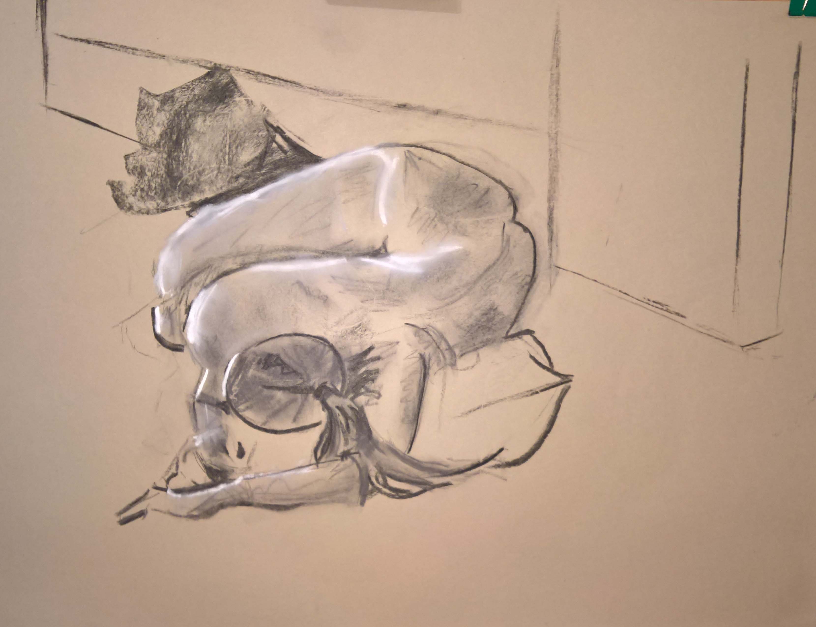
The painting is 825 x 550 mm while it is not a still life it does seem to be a careful consideration of space. My eye enters the picture at the bullfighter’s hand, the dominant bullfighter breaks the left edge of the picture frame with his elbow my eye flows across the darker tones at the top of the picture, down the pink and blue right margin then investigates the impressionistically rendered arena visible through the door opening before returning to the bullfighter.

Blackadder has for me captured the moment before the bullfighter enters the arena, there seems to be a look of trepidation on his face, his last moment of quiet contemplation before entering the fray. The light is another thing that rings really true the high key tonal range of the arena visible through the doorway is reminiscent of the hot Spanish mid afternoon sun which contrasts well with the cooler darker interior tones, the gap in the middle of the tonal range extenuates the difference between the two contrasting ends of the tonal range. The contrast is intensified by the detailed rendering of the figure as opposed to the abstract marks of his surroundings. The overall composition is very modern reminiscent of a photograph taken quickly as the opportunity arose without recourse to the traditional rules of composition.

bullfighter-1961-82-5-x-55

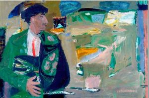
Figure 1 (17 02 15 01) The Bullfighter by Elisabeth v Blackadder oil painting 82.5 x 55

The Bullfighter was painted in 1961 in the early part of Blackadder’s career my other two choices are from much later in her career, the first of which is Chinese still life with arum lilies.

chinese-still-life-with-arum-lilies

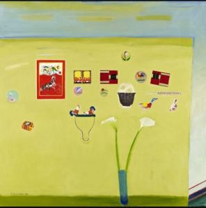
Figure 2 (17 02 15 02) Chinese still life with arum lilies, by Elisabeth V Blackadder oil painting

Blackadder arranges her still lives, not on a tabletop in the traditional manner but vertically on a wall, this frees her from the traditional still life arrangement and allows her objects to roam the picture plane in an almost Mondrian like manner giving her much more compositional freedom. She maintains the empty margin on the right hand edge of her canvas using a reversed C shape to frame her composition. She has again the tonal gap between her objects and the ground which allows her objects to float in front of the the surface of the wall.

The objects are very detailed with a Chinese theme and are hard edged, with the exception of the lilies, this serves to make the lilies stand out and become the main subject of the painting. That the lilies are grounded on a surface in front of the wall serves to force them forward in the picture plane. If the objects were painted without detail, this would further enhance the abstract Mondrian like feel of the work but the detail gives a Chirico dreamlike feel to the work.

still-life-with-iris-2000

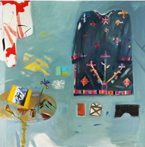
Figure 3 (17 02 15 03) Still life with irises, by Elisabeth V Blackadder oil painting

My final choice, Still life with irises, whilst retaining the surrealist feel, owes more than a passing nod to Matisse, the bright colouring gives a cheerful mood to the painting. Again the objects seem to float in front of the vertical ground and she has maintained the right hand margin that is so characteristic in her work. The left hand and top edge of the canvas break the forms leaving me with an desire to complete the forms and thereby extend the painting. Although the background has a consistent feel to it, the detail that Blackadder has given to it is overwhelming on closer inspection; it could stand as a painting in its own right without the addition of the objects.

Blackadder fits the mould of the great British artists’ in that like Turner, Bacon and Freud she is a maverick, difficult to pigeonhole into a school or a movement. Well that was quite an experience, a non-Blackadder fan becomes converted and is looking forward to seeing some of her work in the flesh, over the course of a thousand word essay, but I am still not sure about the botanicals and the cats.

Yours

Mickos