Abstraction

Abstraction

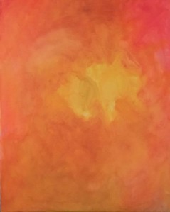
One way into abstraction is to examine the details of a scene. I looked long and hard at my Still life Red and Green and decided that the bit I was most interested in, was the highlight on the apple. I blew this up and panted it as a painting in its own right. It is hot and fiery and is a long way from being recognisable as the highlight on an apple. It reminds me a little of a Rothko albeit painted in a brighter and happier key and less geometric.

Figure 1 Number 01 oil on 40 x 50 cm canvas board

I bought a new brush that is 50mm wide and I was experimenting with it to see how it went using only two colours dioxodine purple and cadmium yellow. It went like this;

Figure 2 Number 02 oil on 40 x 50 cm canvas board

I can’t really explain why but for some reason Easter was on my mind, I was listening to Cockney Rebel and Mr Raffles came on, which kind of nails it in the first two lines, but as well as that, the purple reminded me of the church. Purple is prevalent in Lent, the silky sheen of the priests garments and the purple mourning shrouds placed over the statues and it is also the brand colours for Cadbury’s Creme Eggs.

The painting just went where it went, with me responding to what went before rather than where I wanted it to go. When this happens I get slightly scared that I am no longer in control, because being in control of my life is what I am about.

The easiest way to bring a painting back into control is to let it dry and then teach it who is in charge with another layer of paint. There is a strange beauty and rawness in this, a wildness that resists taming, let it be wild.

Writing on painting


I have been thinking about painting and more particularly about what painting means and why I paint what I paint.

Being an art student, I have to write about the paintings I paint. I am never really sure if I am writing the right thing, but everything I write could be quoted as an illustration of how I feel about a particular painting, painting in general or even taken out of context with a Freudian slip to explain how I feel about anything whatsoever.

Sarah has a very rare disease and went to see a specialist doctor in Madrid. The doctor gave her the most marvellous news, the day after receiving the news she took this photograph from her hotel balcony.

Figure 1 Digital photograph taken by Sarah

As a northern European it is not difficult to be inspired by the sun glinting off clay tiled roofs in a hot climate there are many such photographs, indeed I have taken such photographs myself when the opportunity presented itself.

This is one I took;

Figure 2 Digital photograph, taken by myself

I thought about this for a while and decided that such photographs are like a dose of vitamin D for Northern Europeans so that Northern Europeans would have a likeness for such views even though they may be considered mundane in more Southerly climes.

Then I thought of the motivation of the photographer, my own photograph was taken as a reference for a yet to be executed painting that I now realise would appeal to Northern Europeans. I know this because I took the photograph, I did the looking and I did the noticing and I eventually realised that such a view would appeal to Northern Europeans

I have no idea of Sarah’s motivations for taking her photograph, there is probably an equal amount of looking, noticing and milliseconds of camera time, involved as in my own photograph. Probably more of each is involved because Sarah’s photograph is taken on a proper camera, not a mobile phone.

In order to reconcile my view of Sarah’s motives for taking her photograph, I like to think that Sarah’s photograph was taken in a new spirit of hope, wonder and happiness resulting from the good news she received the day before. Sarah’s journey must of necessity fit my perceived story or impression of Sarah’s journey.

This may or not be true, and I will of course discuss it with Sarah the next time we meet up, in the meantime inspired by what I perceived to be the emotions contained within Sarah’s photograph I painted this;

Figure 2 Hope wonder and happiness in Madrid, oils on 50 x 40 canvas board

I hope it makes you feel hope wonder and happiness because these are the emotions I have tried to express in this painting along with a bit of technique of perspective and the golden section. If you just feel a bit of vitamin D don’t worry because that is, I have decided, a Northern European thing.

I could say that this painting encapsulates the contrast between the Spain of Don Quixote and the vibrant modern Spain of the twenty first century, but having read the foregoing, you would know I was making it up as I went along.

What is written about paintings or photographs is the writers subject opinion of the same and rarely if ever coincides with the opinion of the artist or photographer. Writing about painting must always be approached with a heavy dose of scepticism while reading.

No votes were influenced by this painting but the writer would like to point out that the references to Northern Europeans were not made with any partisan or racial intent.

P.S.I have been reading the new edition of What is painting  by Julian Bell on my tube journey and I have managed to answer some of my own questions in the regard and be able to cite high authority for these answers. George Berkelya philospher in the !8th century came up with the ding an sich theory  Which roughly taranslates to the thing in itelf is unknowable, meaning that objects only exist as they are percieved . Kant ran with this theory that material.representations of an object are the only thing we can know. It follows that all figurative paintings are an expression of the object in themind of the painter.

Joshua Reynolds addressing the Royal Accademy in 1786 said;

If we suppose a view of nature represented with all the truth of the camera obscura, and the same scene represented by a great artist’ how little and mean will one appear in comparison to the other where no superiority is supposed from the choice of subject.(Bell p. 54)

Reynolds said this more than 50 years prior to the invention of the Camera ( for use of the camera obscura in art see Hockney’s Secret Knowledge)

Bell goes on to propound a theory of expressionism with its roots in the 18th century alongside the accession of artists leaving mechanical reproduction to the camera.

I think it is really nice when things come together of their own accord and I am at last beginning to understand what the philosophers are going on about

Bibliography

Bell, J (2017) What is Painting, Revised Edition: London. Thames and Hudson

Hockney, D. (2006) Secret Knowledge, New and expanded Edition: London. Thames and Hudson

En plein air

En plein air

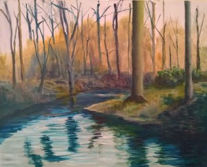
The sunny Sunday that we had in February prompted me to take a 500 x 400 canvas board for a walk in the woods together with my pochade, folding easel and chair.

Usually when I venture out with the pochade I paint on the 250 x 200 cm boards that fit inside the pochade, a painting this size can be complete in an hour maximum but that day I took a board 500 x 400 cm and the metal easel to stand it on. In the house I stand at the easel but the lightweight metal easel is not tall enough to stand at so I took the folding chair as a compromise.

I often walk in the woods so I knew where I was headed, a small gravel island in the middle of the stream by the bend. I spent most of the afternoon there, maybe longer, a painting is not a measure of time but that is exactly how long it was. I painted this;

Figure 1 Spring early Spring, oil on 50 x 40 cm canvas.

I always seem to paint a bit looser when I paint outside, things seem more direct and immediate and it is like you are over excited to get painting having had to set up all the equipment, that the drawing stage gets missed. The substitute is a kind of quick measuring with my hands to decide the composition before I actually begin painting, a bit like in the still life class when you quickly decide where best to put the figure on the page, before starting to make marks.

I carried the completed painting back to the car still fastened to the metal easel and adjusted the legs of the easel to wedge it in the boot for the journey home. I transferred it to the large easel and let it dry for a couple of days before I tinkered with it a bit, and that is basically the how I did it.

The why is a little more complicated but not overly so. I had the options of sketching the scene in graphite, watercolour, a small oil or even taking a photograph and coming home to paint from my reference, but I have done all that before. I had seen people do this on reality TV shows and wondered how hard it was, in real life, it turned out to be not that hard. I had also seen photographs of Cezanne and Monet doing this and thought that if I did it I would be able to see for myself if there was any benefit in painting this way. It turned out that there was, it takes away the guess out of the bits you didn’t pay attention to when you were making your reference sketch that you sometimes have to go back to look at when painting on a bigger scale, the reference is right there in front of you.

It was a quiet part of the woods so it was an immersive experience there was no cat to feed, no internet to check, no kettle to boil in fact nothing to disturb the act of looking and painting. It could have been a hundred or more years ago when it was indeed possible to slow your eyes down and look properly and thoroughly at what is staring you in the face. Perhaps that is the true context of the exercise, to be at one with nature a rare slow concentration in these rushed times, I think the painting gives a sense of that.

Still life

Still life with restaurant 1

Last November I had a delightful lunch in a lovely restaurant in Paris near the Marmottan Monet Museum called La Rotunde de la Muette.

As the people on the next table left, I did a quick sketch of the still life they left behind before the waiters came to tidy up. It was a scene that stayed with me, one of those cheer me up memories for a rainy day, a sight that looked for all the world like an impressionist painting.

Figure 1 sketch ink on A6 cartridge

I recalled my memory when I was back in London especially when I saw this;

Figure 2 A Bar at the Folies Bergere, Edouard Manet

and then later this;

Figure 3 The Dining Room, Vernon Pierre Bonnard

And of course this;

Figure 4 Christ in the House with Martha and Mary, Diego Velasquez

In each case I was fascinated with the importance of the still life in the overall composition. I thought about it for a long time and then I painted this.

Figure 5 Still life with Restaurant Oils on 50 x 40 canvas

What is it?

It is a figurative oil painting on canvas in landscape format 50cm x 40cm. The background is washed subtle blues that give a suggestion of distance, there is little detail in the mid ground, preserving the aerial perspective whilst the foreground is fully detailed drawing the eye to caress the still life forms at the expense of the deliberately peripheral ground.

What was the process?

The initial inspiration was the small sketch done on location, further inspiration came from the works at figures 2, 3 and 4, the composition of the final piece was based on the Golden Section and was drawn onto the canvas using dilute blue oil paint The whole of the canvas was washed in using oil paint diluted with Gamasol and then thicker layers of paint were added to the foreground and midground to bring them forward.

What is the context?

It sits in the long tradition of European easel painting and is particularly inspired by the images at figures 2,3 and 4. Still life has been an important genre in painting since early times and it flourished in the Renaissance as an excuse for the artist to display his talent and techniques, Caravaggio in the Baroque period added the most marvellous still lives to his religious paintings and you can see the importance of the still life in Velasquez’s painting at figure 4 . In 17th century Holland the still life reached its epoch in the Vanitas paintings, as religious paintings were no longer required painters turned to depictions of the wealthy object of their merchant patrons, however the history genre paintings still required a amount of still life objects to add realism to the overall paintings, thus the still life genre retained its importance. With Manet the supportive still life flourished, you only have to look at the discarded luncheon in Le Dejuener sur l’herbe or indeed the still life on the bar at figure 2 to realise how important to the composition as a whole the still life group is. Whilst Bonnard is famous as a colourist the importance of the still life objects in his paintings is patently obvious as can be seen in Figure 3.

The painting is an investigation of space, in the hole in the wall fashion, using aerial and single point mathematical perspective to create depth on a two dimensional canvas.

It would have been quite easy to develop the midground and the background of the painting to take the total focus off the still life group and make it subservient to the busy restaurant, but the still life group was what caught my eye in the first place, it speaks as an absence of people, almost in a vanitas way, fore-telling that people are transient and there will always be empty bottles and glasses and bills in the restaurant long after the current patrons are dead and gone. It is an extortion, if you like, to live well, because one day there will be another to take your place after you have left. The empty table and the still life contrasts with the ghostly conviviality of the diners in the midground.

What would you change if you had to do it again?

This is not a difficult question to answer, because I did do it again, although in a different way and this question is answered further on in this post.

Still life red and green

Having painted still life in a restaurant I thought a little more about still life went to Sainsbury’s and set up a still life and did a few sketches and drawings.

Figure 6 Compositional sketch for Still life red and green, graphite on A4 cartridge paper.

Then I painted this;

Figure 7 Still life with red and green, oils on 40 x 50 canvas board

What is it?

It is a figurative oil painting on canvas board in portrait format 40cm x 50cm. The background is washed subtle blues that give a suggestion of distance, there is no midground, the foreground is fully detailed emphasising the form of the still life objects and their relationship in three dimensional space.

What was the process?

The inspiration was to investigate space in relation to the forms, the composition of the final piece was based on the Golden Section and was drawn onto the canvas using dilute blue oil paint. The whole of the canvas was washed in using oil paint diluted with Gamasol and then thicker layers of paint were added to model the forms. Once the composition was established the still life set up was removed and the objects were handled to establish their volume and feel.

What is the context?

It sits in the long tradition of European easel painting. Still life has been a genre since Egyptian art and after its zenith in seventeenth century Holland it was thoroughly investigated by Chardin in the eighteenth century and again by Cezanne in the late nineteenth century.

This painting is an honest investigation of the volumes and forms of the objects and the light falling on them. It has avoided the chiaroscuro of Chardin preferring the lightness of Cezanne

What would you change if you had to do it again?

I would soften the hard edges within and as contours of the fruit  and introduce darker darks to the fruit to give more modelling.

Still life with restaurant 2

Still life with restaurant 1 had been hanging on the studio wall for a couple of weeks and I began to think it would look better if the still life was a bigger focus of the picture plane and to further subjugate the restaurant. So I painted this;

Figure 8 Still life with restaurant 2, oils on 50 x 40 cm canvas

What is it?

It is a figurative oil painting on canvas in landscape format 50 x 40 cm. The background is washed subtle blues and greys that give a suggestion of distance, the midground is suggestive of a crowded restaurant, the foreground is a fully detailed still life

What was the process?

The inspiration was Still life with restaurant 1 the composition of the final piece was again based on the Golden section and was drawn onto the canvas using dilute blue oil paint. The whole of the canvas was washed in using oil paint diluted with Gamasol and then thicker layers of paint were added to model the forms. Once the composition was established the still life set up was removed and the objects were handled to establish their volume and feel.

What is the context?

It sits in the long tradition of European easel painting and has a more modern post impressionist feel than the first version. The paint handling in modelling the forms is much softer that either of the two earlier of the still life’s and it is all together less harsh in the choice of colouring producing a more harmonious gentle effect. The still life dominates the picture plane whilst still giving a nod to the restaurant setting.

The figure on the right reminds me of an out of focus Vincent and is probably an unconscious reaction from my trip to Auvers sur Oise last November.

What would you change if you had to do it again?

Seriously not a lot it may benefit from developing the background to give the whole thing a flatter less perspectival feel bur the background is quite flat and mirror like already so I am not sure if this would help. I did do it again though in a much flatter and different style.

Still life with restaurant 3

There was something about the composition of the second version that got under my skin that meant something deeper to me. I investigated this composition further in my sketchbook because I was a little unsure how to take the series on.

I produced this;

Figure 9 Sketch ink on A4 cartridge

This followed;

Figure 10 Sketch ink and marker pens on A4 cartridge

And finally this;

Figure 11 Sketch ink on A4 cartridge

Eventually I had the courage to take up the brushes again and I painted this.
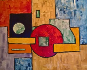
Figure 11 Still Life with Restaurant 3, oil on canvas board 50 x 40 cm

What is it?

It is a non figurative oil painting on canvas board in landscape format 50 x 40 cm. There is an overall flatness to the piece that is disrupted and denied by the overlapping forms and the positioning of the colours giving a shallow picture space.

What was the process?

The inspiration was Still Life with Restaurant 2 the composition of the final piece was again based on the Golden Section it was painted alla prima using brushes and a palette knife.

What is the context?

It sits in the long tradition of European easel painting but is somehow no longer a traditional easel painting. It has a contemporary feel to it and it is only from the title and the sketches that you can realise that it is a struggle with the form of objects in a similar way that Picasso and Braque struggled with form in their cubist experiments but with a markedly different result.

The use of texture in painting is a modern innovation and this painting exploits the use of texture to the full in the relatively shallow picture space.

The small blue rectangle at the base of the picture is almost a monochrome version of the original picture, this was unconscious and I only noticed this after the painting was dry.

What would you change if you had to do it again?

Absolutely nothing, and as well as that, this was the most enjoyable painting of the series to paint there were no forms to achieve and the painting just flowed where it wanted to go with only a slight touch of the rudder by me.
Drawing

How your drawing is part of your process and how you could improve that creatively.

Drawing, how I love drawing, I draw because I am, mostly I draw in public places when I am relaxed. I suppose there is a bit of Degas in me, I like to draw people and I sketch most when I am in the pub or a restaurant and I am relaxed and people watching.

I keep my A6 sketchbook and pen with me at all times, and I am finding that the more I draw, the more it informs my visual memory. With my sketches as notes with the help of the lay figures I can construct a fairly convincing painting.

I use drawings to work out my ideas and compositions in larger sketchbooks but I am beginning to treat my compositional and tonal drawings as maps rather than blueprints and to paint around the feeling of the drawing rather than the actuality of it.

I photograph my drawings and overlay them digitally with compositional grids and triangles and golden sections and pyramids just so that I am sure that there is a structure beneath the surface of my paintings that will hold the whole edifice together and so that it can be there without drawing attention to itself. This probably comes from my day job where the foundations support an impossible building or the concrete frame work supports a pretty cladding.

The day job is probably another reason I do prepatory drawings. If I start a drawing I invariably finish it, whereas a painting can go on for a while longer. The prepatory drawing has the ability to retain the original idea for longer than it takes for the painting to be made or the subject to disintegrate. In a way I think this helps as rather than painting the actual subject, you a painting a solidified memory of the subject.

The Still life restaurant series that I painted was helpful in this regard in that the third in the series was three steps away from the original sketch, a long way from drawing and although I made a few drawings to get the feel of the new direction I went I feel that this was just to calm down a bit of unfamiliar territory before leaping in with the brush. The last painting is not very like it’s prepatory sketches and the inspiration for it came more from the previous paintings.

The only drawing, involved drawing that was involved in the in the third painting was to draw round a dish and a jar to get the circles. At the request of my tutor I have been drawing with a brush, this is giving my paintings a freer looser quality that I quite like and avoids the grin through of pencil lines.

Perhaps less drawing is the way to go forward, drawing and painting are of course two distinct activities while in historical times such as cave painting and Egyptian painting the two were closely allied they have moved farther apart since then. I need to make this separation clear in my own head especially when I dance at my easel, more dancing less drawing.

Landscape

Landscape

I was lucky enough to visit the Anselm Kiefer exhibition at the Royal Academy several years ago, the exhibition that course link 19 refers to. I remember the monumentality of it, remember the layers and the straw and the texture of the enormous paintings and the gigantic lead book sculptures.

Notes on Anselm Kiefer in Conversation with Tim Marlow At: https://www.youtube.com/watch?v=vlm5tgistqA  Accessed18/02/19

Are you a history painter in 21st Century? I use history in my paintings almost as a material as a clay to be moulded a traditional history painting is like a photograph of a moment in time. / My paintings have many layers which gives a sense of time. / I use photography in my work as the basis a sketch the process destroys the photograph. /I am not political / I explore recent German history to see how I would have felt about it had I been there / I was discovered by a German Jew / I wouldn’t paint if sometimes I didn’t surprise myself / I don’t seek perfection just the best I can do at the time /I go with the flow / Beuys was an occasional mentor / ritual metaphor and German Romantic history were shared passions / Art and religion are different things but similar / I do lots of reading mainly poetry, it is concentrated like a diamond / My process is to work hard emotionally them I stand back to analyse and see which way the work wants me to go. Each time you make a decision you lose 100 other possibilities. You have to keep going along the path / once the decision is made you can’t go back because the starting point is then lost / Sometimes when I see my work in different settings I realise it is not finished / Looking at the retrospective exhibition I can see connections between what I am doing now and what I was doing 40 years ago. /

I was not a big fan of Marlow’s interview technique, he seemed to be forever leading the witness with his own agenda rather than establishing a conversation, it was a bit like watching a football manager being interviewed in a press conference.

Lui Xiadong chronicles recent Chinese history there is a dearth of information on the internet about this artist so I have ordered the exhibition catalogue from Amazon of the exhibition The Three Gorges Project: Paintings by Liu Xiaodong at the Asian Art Museum of San Francisco in 2005. I will nip back and edit this post when the book has been delivered and I have read it. It does though seem a bit of a shame to research paintings ten meters by three meters in a book.

Wrotham

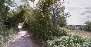
I had to visit Wrotham in Kent and while I was looking it up on the map in Google I came across this photograph.

Figure 1 Digital image courtesy of Google maps

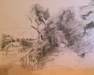
I thought it made a good subject for a painting but that the composition was all wrong, the mass of trees needed to be on the opposite side of the picture to hold the eye in the picture. I did a quick compositional and tonal sketch basing the composition loosely around the golden section.

Figure 2 Compositional and tonal sketch Charcoal on A4 cartridge

The assignment called for a study in thick impasto paint, if I used oils it would never dry in time so I chose to do an under painting in acrylic impasto gel. I tinted the gel with some grey acrylic mainly so I could see where it was and with my sketch book in view I roughed in the forms. I left the sky and path areas untouched to contrast with the impasto foliage.

Figure 3 Work in progress impasto acrylic ground

It was great fun working with a palette knife and a one inch brush and eventually parts of the impasto were about a centimetre thick.

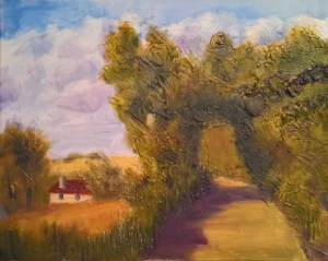
Once it was dry, I switched to oil paints, laid in a washy watercolour type wash for the sky and then scumbled and glazed the foliage over the acrylic impasto.

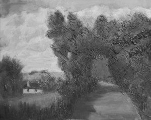
Figure 4 Wrotham Kent, Oils on 500 x 450 canvas

Context

This is a fairly standard landscape easel painting painted on a 500 x 450 canvas,  you can almost feel the wind in the trees and I think much of the energy of the original sketck has ended up in the finished work. I can see the underlying use of the Golden section as a compositional device and perhaps if he were paying more attention as he painted, he would have altered the clouds slightly to accentuate the golden spiral through the clouds as in the diagram below. None the less there are good eye paths through the picture. The mass of foliage on the left hand edge of the picture prevents the eye leaving the work. There are strong varied big shapes for the eye to examine in an abstract way,

Figure 5 Golden spiral superimposed

The texture of the foreground works well against the thinly painted sky giving a fine sense of relief somewhat akin to Constable’s sketches for his six footers. The thickness of the impasto would indicate that study has been invested in both Auerbach and possibly Bomberg.

I have taken the liberty of adding a black and white reproduction of the finished work and while generally the tonal patern is good promoting recession I would have liked to see greater tonal definition of the  highlights in the foreground foliage.

Figure 5 Black and white image

The colouring is reminiscent of the French palettes of the late nineteenth century, there is a growing confidence in the use of colour. I suspect that the inner glow of the work is possibly down to the fact that the process involved working on a white canvas rather than a coloured ground.

The foliage and the sky are quite expressively painted with considerable freedom and I suspect great fun was had in the making of this picture.


Colour

Colour

Write about how you feel about colour and how you might gain a greater understanding about colour?

Colour is very important to me because I paint, but as well as that, I have very vivid feelings about colour. I have synthesesia, a disease that lets you see sounds as colours when you close your eyes, Kandinsky had the same disease. Normally, it is quite pleasant, you listen to music you like, close your eyes and you see a colourful abstract movie of what you are listening to. Today, however, it became quite unnerving, the dentist was playing a radio station with gentle relaxing sing along pop music which alternated with the fluorescent turquoises, reds and yellows of the sound of the drill. I was quite surprised that my brain interprets fear and pain as florescent hues, but then I remembered the florescent orange of concussion from all those years ago. There is another aspect to synthesesia that is seldom commented on, in that it works the opposite way but the music that colours inspire in my mind is mostly classical.

My conscious, I suppose analytical feelings about colour tend more toward the harmonious, I love the ochre- greens of Giacometti, the subtle contrasting complimentary colours of late Gauguin and yet still the vivid contrasting hues of Vincent.

You can only gain a greater understanding of colour in four ways.

Looking very hard at colour around you

Firstly there is looking very hard at it. We are surrounded by an ever increasing number of images but to understand colour better you have to look at it very hard noticing what it does by itself and how it is influenced by the colours around it. How it makes you feel and what it conjures up in your mind there is a very subjective aspect as to the emotions that colour makes you feel and although some generalisations can be made, it is highly individualistic.

Visiting galleries

Visiting galleries allows you to look very hard at how other artists used colour in their process. It is fine to look at art books but these can only get vague clues as to the artist’s process with regard to using colour. you can only ever see how an artist uses colour by looking at the original work, artworks were not designed to be a walkthrough exhibition, they are something you need to contemplate and wonder at slowly.

Since starting this course I have spent a lot of time in the galleries in London and I am beginning to understand the colour techniques that other painters use as part of their process.


Read and understand the theories of colour

There are many theories of colour, Aristotle developed the first one that held sway until Newton’s theory of colour in 1660. Newton‘s theory was challenged be von Goethe who introduced the psychological effect of colour. All three of these theories were based on the colour of light using prisms.

It was le Blon who first considered colour as an artistic medium and introduced the notion of primary and secondary colours and in 1855 Chevreul’s research into died threads and the law of simultaneous contrast greatly influenced modern art.

Munsell created a codified system for classifying colours relative to their hue, value and chroma in the early twentieth century and that was about the end of scientific colour theory.

Of course each artist has their own colour theory and while being based loosely around the current scientific theory is often particular to each given artist or school of painting.


Experimenting with colour in your work

I am working with quite a limited palette at the minute. Two blues, two reds, two yellows and white, this is teaching me that I don’t need any other colours and has removed most of the mud from my paintings, with the two versions of the primaries I am becoming to understand the warmth and coolness of the colours and I think this is helping to give me a greater understanding of converting form from three dimensions to two.

Since starting this course I have spent a lot of time in the galleries in London and I am beginning to understand the colour techniques that other painters use as part of their process.

Project 2 Abstraction: Writing in painting

Writing in painting

If writing is used to tell stories and communicate ideas then painting is the oldest form of writing. The cave paintings are a form of narrative, the text for religious narrative and the earliest form, in the blown handprints of writing “Ug was here”. The cave paintings are symbols representing real living things.

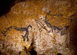
Perhaps one of the greatest early example of painting as narrative is The Shaft Scene at Lascaux. This arrangement, made famous by its narrative potential, is one of the rare examples in which the subjects and themes refer to a specific episode.(Aujoulat)

Figure 01 The Shaft scene at Lascaux

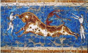
The Minoans continued the narrative theme with the wall painting Bull Jumping a composition that would not look out of place in a Manga or Marvel comic with speech and thought bubbles added.

Figure 02 Bull Jumping at Knossos

Then it was the turn of the Egyptians, who, through their rigid set of rules for painting turned the image into writing. The painted hieroglyphs became the words to accompany the images.

For the Christians the word was all powerful and the image was relegated to a supporting role until the dawn of the Renaissance when the narrative was concluded in the image, then for 200 years or so, almost the only word to appear in paintings was INRI.

Figure 03 Detail from Grunewald’s Crucifixion

Lautrec and Mucha made extensive use of graphics but theirs was poster art where words were necessary to inform the viewer of the event.

Apart from that instance, words then disappeared from paintings until Picasso and Braque brought them back as a way of preventing their cubist works from descending into abstraction.

The Dada artists were fond of words in their images, the surrealists less so Magritte’s Ce n’est pas un pipe, Duchamp’s R Mutt and LQOOH are the only examples I can think of until the advent of Lichtenstein’s pop art, whose speech and thought bubbles and onomatopoeic sounds were reminiscent of the comics. and then of course there was Warhol.

Joseph Kosuth and Ed Ruscha used text in their works in a very surrealist way, Banksy uses it in a political way and Samsudin Wahab is highly political in his use of text, but perhaps also uses it to tie his work to the newspaper inspiration from whence it springs.

I had a flick through Vitamin P2 and was quite surprised to discover that only thirteen of a hundred and fifteen artists included text in the featured works.

Do I use it, not really, I have used it in the past as part titles of newspapers when I was experimenting with cubism and I used it a little when I did a series of paintings on shop fronts but as a general rule I avoid it. I think it draws the eye too much, when it is necessary such as on a wine bottle label I prefer marks that look like writing from a distance but disappear into squiggles when you get close up, in much the same way that Annie Albers used it in her weaving. I don’t even sign my paintings on the front as I think the signature has the same effect. While we are speaking of words, I am not very keen on giving titles to my paintings other than short descriptive ones to distinguish one from the other words seem to limit the attention of the viewer, once you have found the words you think you understand and move on perhaps a better way is a brand symbol the way Basquiat used the three pointed crown.

One of my pet hates is writing on the walls of museums and galleries at exhibitions, the next time you go to a gallery look how people crowd around the words at the beginning of each room compared to how quickly they pass by the works on show. You can read the catalogue before you go or after you have been, just bathe your eyes on the works on show it could be half a lifetime before you see them again, there will be words on your phone when you switch it back on again.

Bibliography

Anjoulat, N. (s.d.) Lascaux: The Shaft. At: http://archeologie.culture.fr/lascaux/en/mediatheque/shaft (Accessed 16/01/19)

Writing in Painting


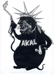
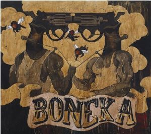
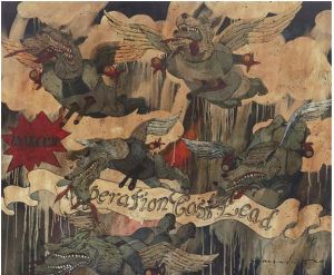
Samsudin Wahab is an artist from Malaysia whose paintings are highly political and current he uses a comic book style of painting reminiscent of Stan Lee, Richard Hamilton or Roy Lichtenstein.

The use of text in his work is usually carried out in a similar colour to the main colour scheme of the works. Politics and the news move at a great pace and the connection between the political event and the artwork would be rapidly lost without a written reference attached to the work. That Wahab embodies the title as part of the artwork is of course his own prerogative but I think it says something about the state of the world today.

I am unable to trace the news/political events related to figures 1,2 and 3, but figure 4 refers to the three week Gaza war of 2008 to 2009 with the banner “Operation Cast Lead”

It is a sad reflection on the number of horrors committed in the world today that this painting was not merely titled “Operation Cast Lead” and everyone would recognise its significance as they do with Picasso’s painting Guernica.

Wahab is known for taking inspiration for his work from his daily newspaper and in comparison to Picasso’s emotional connection to his Spanish homeland in 1937, I feel that this particular work lacks such emotional connection and has a journalistic feel to it as a consequence.

It could be that as part of his process Wahab feels the need to embody the title of his work as a banner headline to prevent his work being renamed as often happened in the past, for instance the true title of Whistlers Mother is A Study in Black and Grey.

Figure 1. Samsudin Wahab (2008) Dogs want to be the Statue of Liberty (Google translation)

Figure 2.Samsudin Wahab (2008) Goddess of Justice

Figure 3.Samsudin Wahab (2008) Puppet (Google translation)

Figure 4. Samsudin Wahab 2009 Dono’s angels fallen from the sky

I was quite familiar with the work of Ed Ruscha having seen the exhibition Ed Ruscha: Course of Empire and referred unconsciously to his work Standard Station in my previous studies, which I later saw at MoMA. His inclusion in an investigation into text in Art didn’t come as a big surprise. I imagined it was referring to advertising slogans and trademarks.

However, when I started to look on the internet he had a whole other oeuvreout there where text was included in his art and the images were almost as a background to his Haiku like poems of modern everyday expressions.

He has experimented wildly with his materials using strawberry jam, ketchup, maple syrup and other media, he even invented his own font, Boy Scout Utility Modern for use in these works. (I already checked, it isn’t a font option on word)

If I have your interest, I would beg you to watch the documentary listed in the bibliography it is a great fantastic summary of the career of Duchamp’s greatest American disciple, and quite possibly the best Art documentary I have ever seen.


Bibliography


Exhibition

National Gallery (2018) Ed Ruscha: Course of Empire. At: https://www.nationalgallery.org.uk/whats-on/exhibitions/past/ed-ruscha-course-of-empire (Accessed 05/01/19)

Internet research

Art Story The (s.d.) At:https://www.theartstory.org/artist-ruscha-ed-artworks.htm#pnt_5 (Accessed 05/01/19)

Culture Vulture (2011) At: https://issuu.com/studio25/docs/culture_vulture (accessed 04/01/19)

Mutual Art (s.d.) At:https://www.mutualart.com/Artist/Samsudin-Wahab/82949F6642F8CAE8#more (accessed 04/01/19)

Wikipedia (s.d.) Edward Ruscha. At: https://en.wikipedia.org/wiki/Edward_Ruscha (Accessed 05/01/19)

Documentary

Riopelle, C.(2018) Curators introduction: Ed Ruscha: Course of Empire, At: https://www.youtube.com/watch?v=IidGsafONKs (Accessed 05/01/19)